


I’m not feeling great today. We’re getting a huge storm front in, and the temperature is dropping a solid thirty degrees today. My headaches have always been the worst during big storms, so I’m not surprised—but it doesn’t make the day any easier.
I needed something easy for today, so I defaulted to cutting and pasting—my go to lately, especially when I want to clean up my desk. And I’ve got a lot of cleaning my desk to do.
I’m moving a bunch of the stuff in my former office (soon to be nursery) into my studio, and it’s been a disaster since last fall when I thought I was going to be packing everything up and moving it across the country back to New Jersey. I’m long overdue for a big purge, re-organize, and shift in how I do things in this room. And this time, it has a hard deadline.
Technique of the Day
Today, I was flipping through some art cards I’ve got on my desk trying to decide which one was going to work for today’s page.
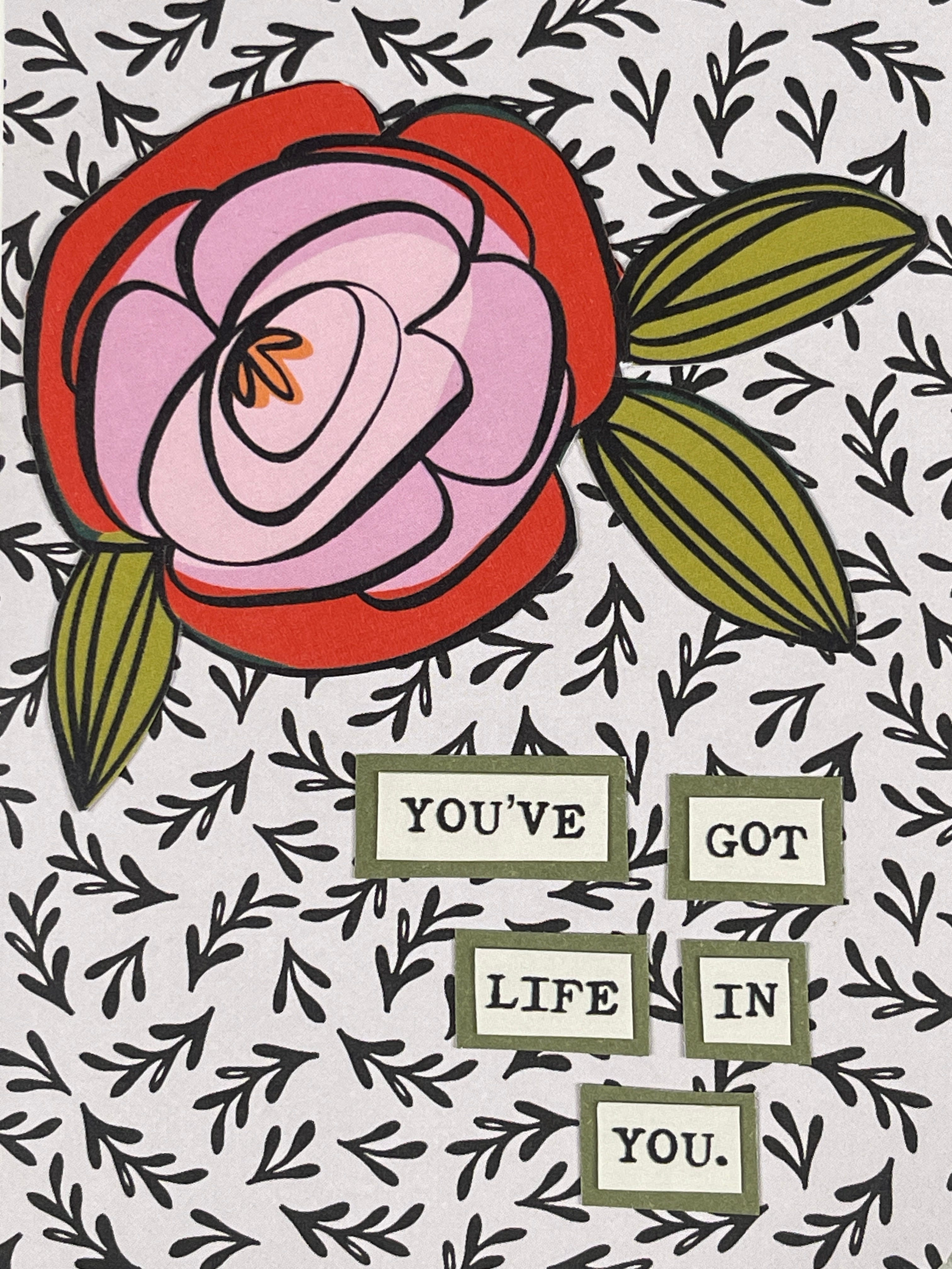
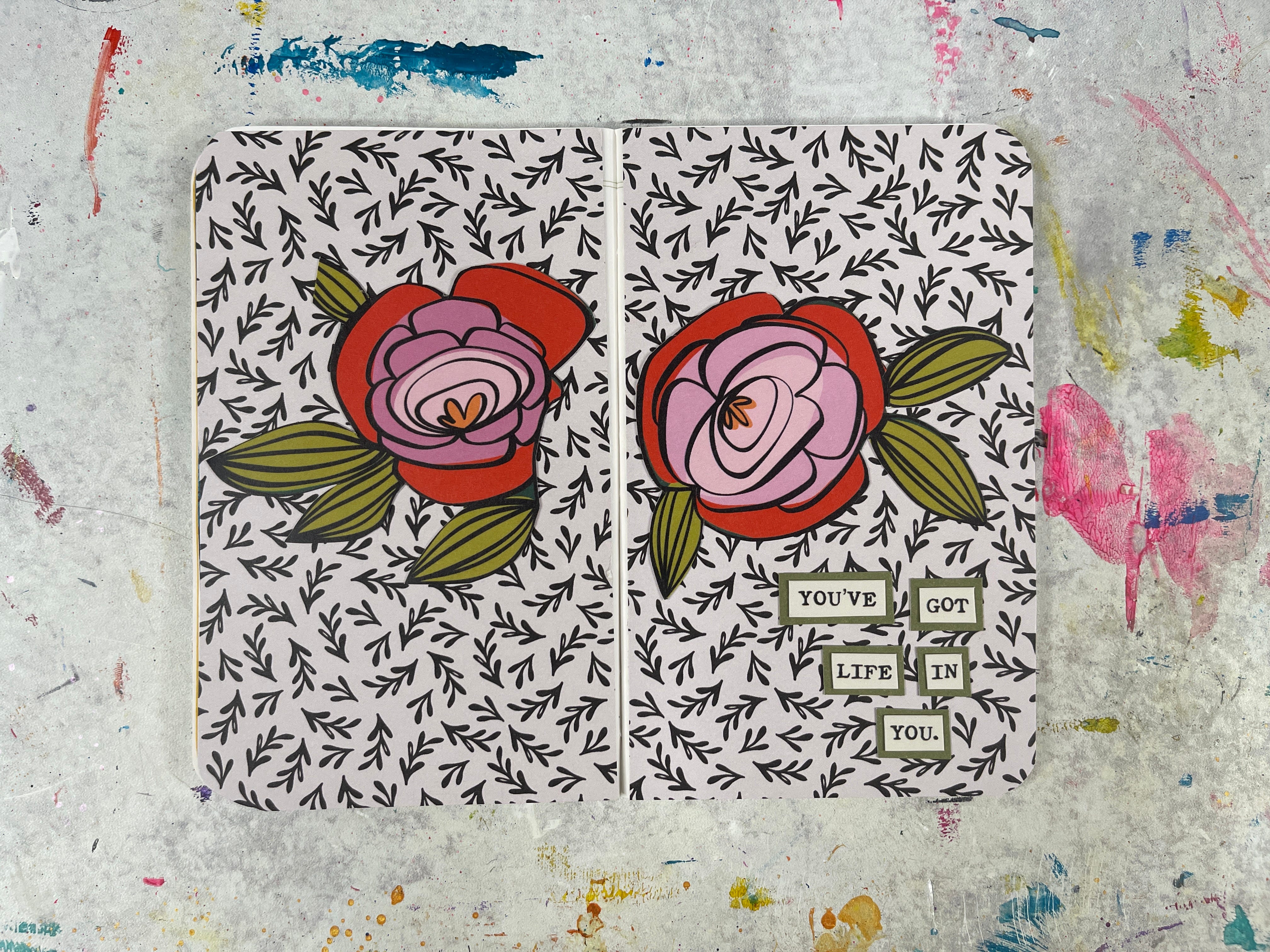
Originally, I grabbed two smaller school-related cards, and I was going to find a fun gel printed background to tie it together, but then I saw this floral art card and decided I’d have a little more fun if I cut stuff up and stuck it down instead.
I went through my patterned papers to find a neutral patterned background—I pulled out this older sheet of (actually Christmas) paper and stuck it in the book.
Today’s page was all about figuring out which papers would look good against each other. Normally, when I’ve got a patterned or busy background, I want to make sure that my icons/photos/images are all visible. So if they’re also super busy—it’s important that I’ve got some type of solid color border or mat on the item.
The florals from todays card were made up of big bold colors and a nice thick black outline, so a mat on them was totally unnecessary. But when I went to add in the little sentiment on the bottom, I knew I needed them to pop off the page a little bit more, so I added a green background (which brings out the colors in the florals)! It makes the words a lot easier to read and looks great.
Supply List
Brandi Kincade
Paper—Crate Paper
This post may have affiliate links.
Tips & Creative Wisdom
Stickers Deserve a Stage
Patterned or painted backgrounds can make small stickers pop, especially ones with lots of detail or white space.
Pro Tip: Keep a few solid gel prints on hand. They’re the quickest way to make any stickerscape look a little more intentional.
**If you’d like to unsubscribe from these Daily Pages emails, but continue to get other emails, click here and learn how to update your settings to best suit your needs.

