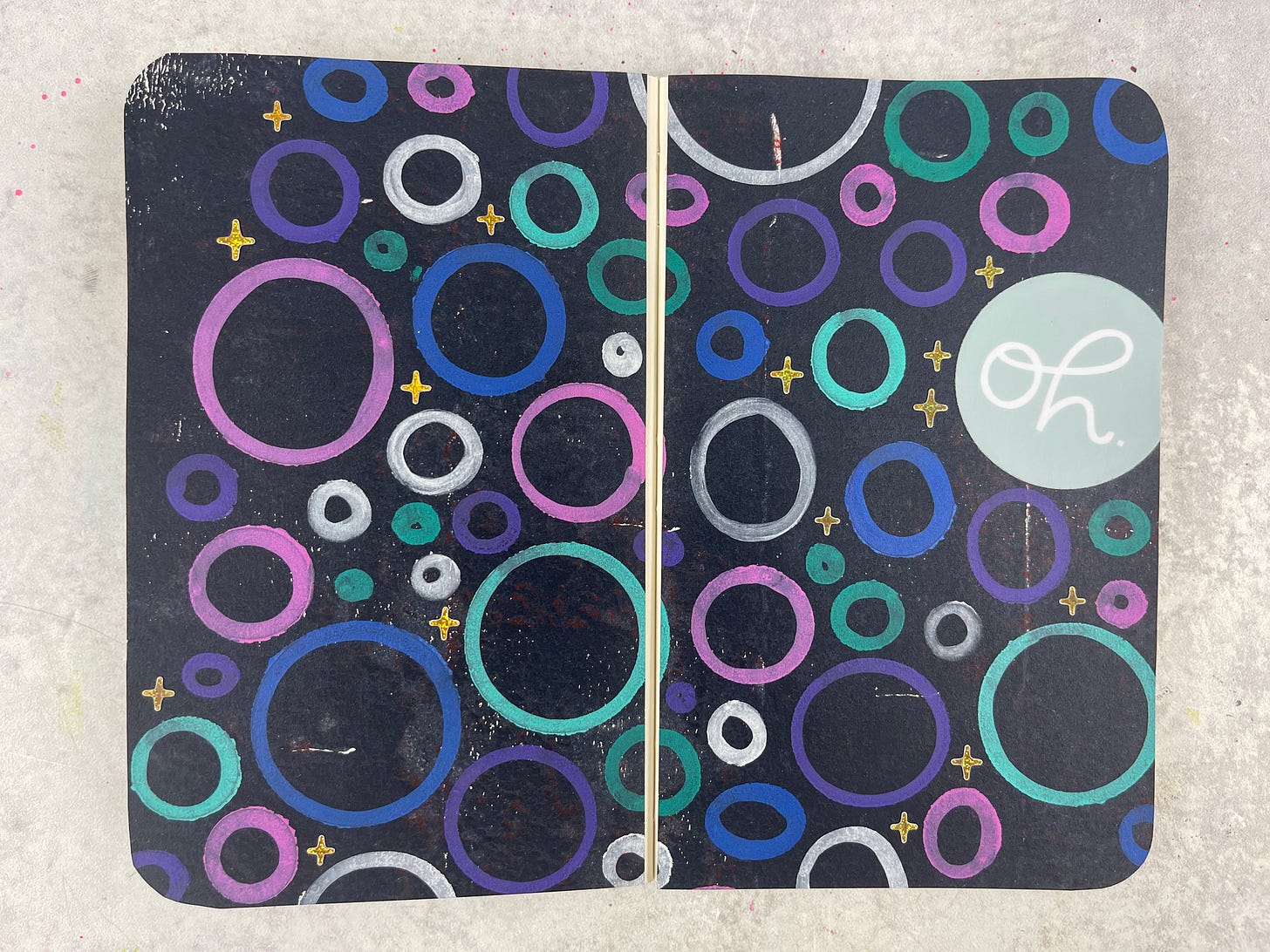
Simple Shapes + Sharpie Markers for Amazing Contrast
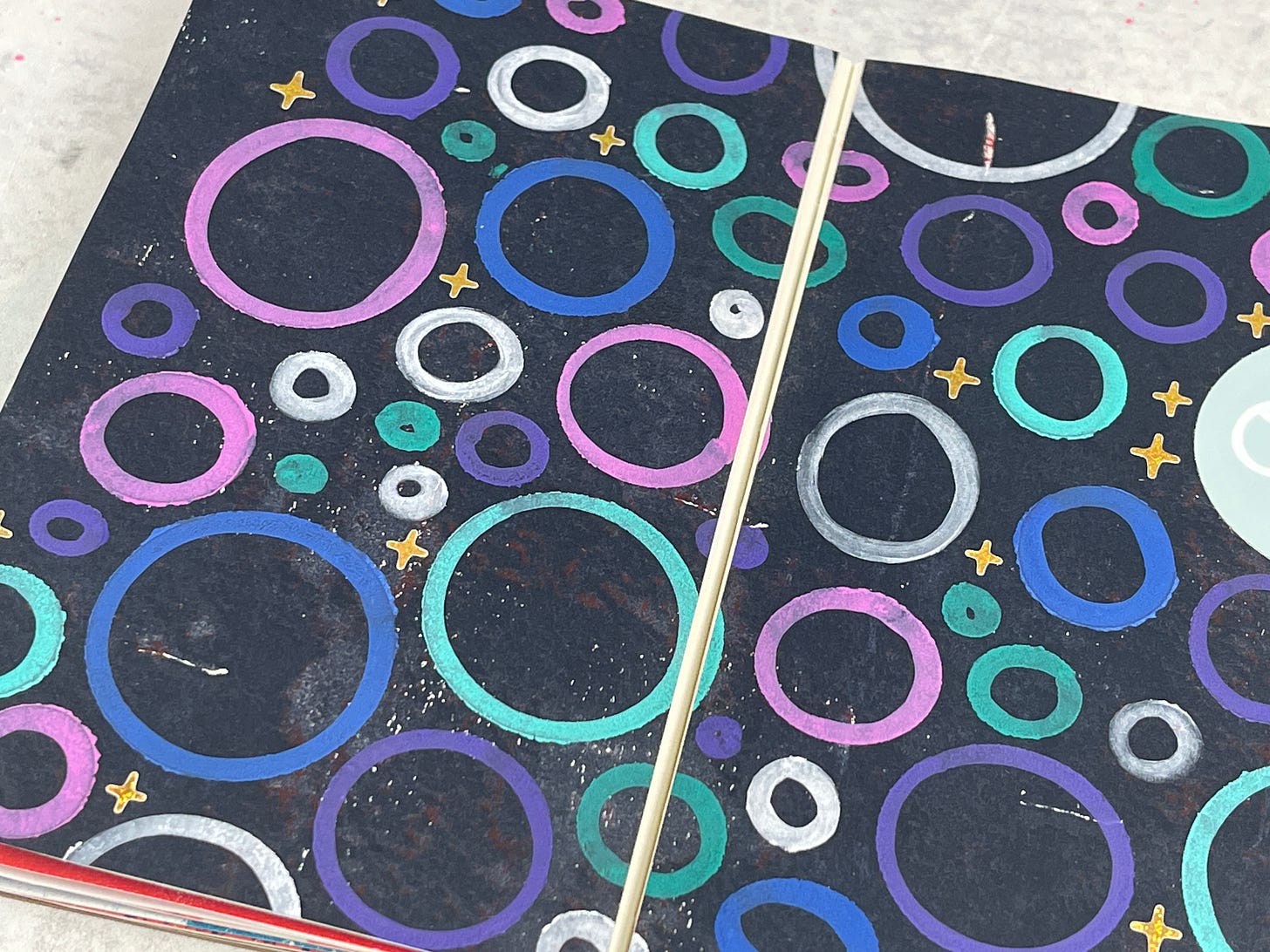
Love how these markers look on black paper
Behind the Page
Over the weekend, I got to cleaning up my stencils from around my studio. I picked up everything off my desk, and found the piles of stencils that I’ve left around the room. I’ve got some really great stencils, and I love how they work with the sharpie creative markers.
Technique of the Day
Last week I used the markers for some journaling, and I didn’t necessarily love how the colors looked on the gel print background I picked out. So today, I wanted to try out a few of the different colors on a black gel print background. I really do love how it came out — I might want the white to be a little bit darker, but once it dried, I think it totally works.
How It’s Made
Supply List
Paper — DIY Gel Print
Markers — Sharpie Creative Markers
Sticker — Brandi Kincaid
Stencil — StencilGirl
This post may have affiliate links.
Tips & Creative Wisdom
Tell a Story Through Contrast
Contrast adds tension and interest to your pages. Use contrasting colors, shapes, or textures to create visual drama on your page. For example, combine soft pastel colors with bold, bright hues, or layer smooth paper with rough, textured materials. The tension between these elements can help convey a mood or story in your collage.
Tip: Create contrast by placing light elements next to dark ones, or by pairing smooth materials like glossy photos with rough textures like torn paper or fabric.
**If you’d like to unsubscribe from these Daily Pages emails, but continue to get other emails, click here and learn how to update your settings to best suit your needs.


