

Design Challenge: Bold Type
Design Challenge: Bold Type
This week's challenge is to incorporate bold type into your project.
Whether it's with a broad stroke of a paintbrush, chunky alphabet stickers, a wide-tipped marker, etc; using a bold typeface is a great way to add emphasis to the words of your project.
------------------
My Challenge Project:
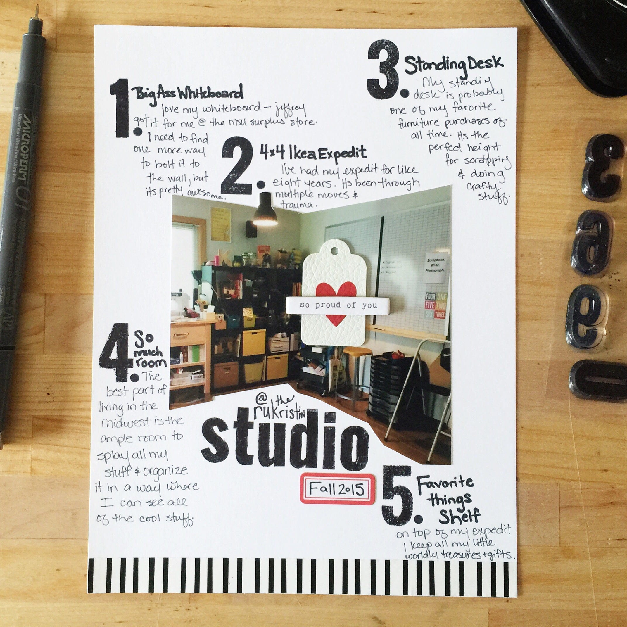
This week's #awesomeladiesproject is all about Bold Type. I went with a one page layout this time and documented a few of my favorite spots in my studio right now. I used my basics alpha and number sets to set up the journaling around my photo. ----------------------
Learn more about the Awesome Ladies Project Scrapbook Challenges, our fabulous creative team, and an archive of all challenges (as they're posted) at http://theawesomeladiesproject.com.
Awesome Ladies Project Creative Team Projects
I used a brush marker to create bold lettering. I also wanted to make the stars stand out by making some of the lines thicker than the others.


For this challenge I knew I had to do something with the quote that has been rattling around in my brain all week; "I contain multitudes" by Ralph Waldo Emerson. I don't own a die-cutter, so I cut out the word that I most wanted to emphasize by hand (the insides of the letters are a bit wonky, so but that’s fine with me). I paired it with a big, blurry photo that I thought fit the message of the quote and kept the rest of the layout simple with paper that I love and some handwritten thoughts.

This challenge was a little difficult for me. I am not a BOLD person. I like subtle. started by going through my pictures and finding ones I liked. Once I did this I had an idea. All of these pictures depicted things that make Me...Me. So I began putting them all together. Two of the pictures are actually spreads I made for My Details. The others are pictures that make me smile. Drinking coffee while working in my office. Snuggling with my kitten butt. The don't sum me up as a person but they speak to my personality.

My habits of clicking around the internet warranted their own journaling card in my PL album (short version: I have too many tabs open and move too quickly and can't remember whether I clicked confirm, send, or whatever else may be an important step in working the internet). I combined a PL card from Studio Calico Carolina Moon kit and half of a page from a 4x6 paper pad from the same kit for a different take on the same pattern. The corners don't match, but I'm learning that this is OK.
. I combined a PL card from Studio Calico Carolina Moon kit and half of a page from a 4x6 paper pad from the same kit for a different take on the same pattern. The corners don't match, but I'm learning that this is OK.")
In digging around my scrap supplies I found these super bold numbers and knew they'd be perfect for my annual "Me @" page! Can you believe I now have a decade of these pages tucked away in an album?? I balanced the bold type with some equally big - but much softer - fussy-cut flowers.

For the bold typography challenge, I chose to use Impact as my font of choice and used embroidery floss/thread and nails on wood to create this Halloween-themed piece.

I used gold oil pastel to add a bold focal point to the page, and painted over it using a watercolour wash. I love how the oil pastel repelled the paint and can't wait to try using this technique more!


I used acrylic and Indian inks to cover the page, marked out a line across and the outline of the feathers, then painted black gesso around the shapes. I filled in the lines of the feathers and used a brush pen to write a favorite quote from Emerson.