

Juxtaposition. A Favorite Art Theme.
I love comparing and contrasting in my pages.
Behind the Page
I love learning. It’s one of my favorite parts of being a human, and it’s one of the things I love about creating Daily Pages. It gives me a space to learn and understand. One of the simplest ways I like to engage with myself is with juxtaposition.
Putting things next to each other that have contrasting elements is a great way to get yourself thinking about what you like (or don’t like) about each of those elements. It’s a great way to kick off your creative thinking.
Technique of the Day
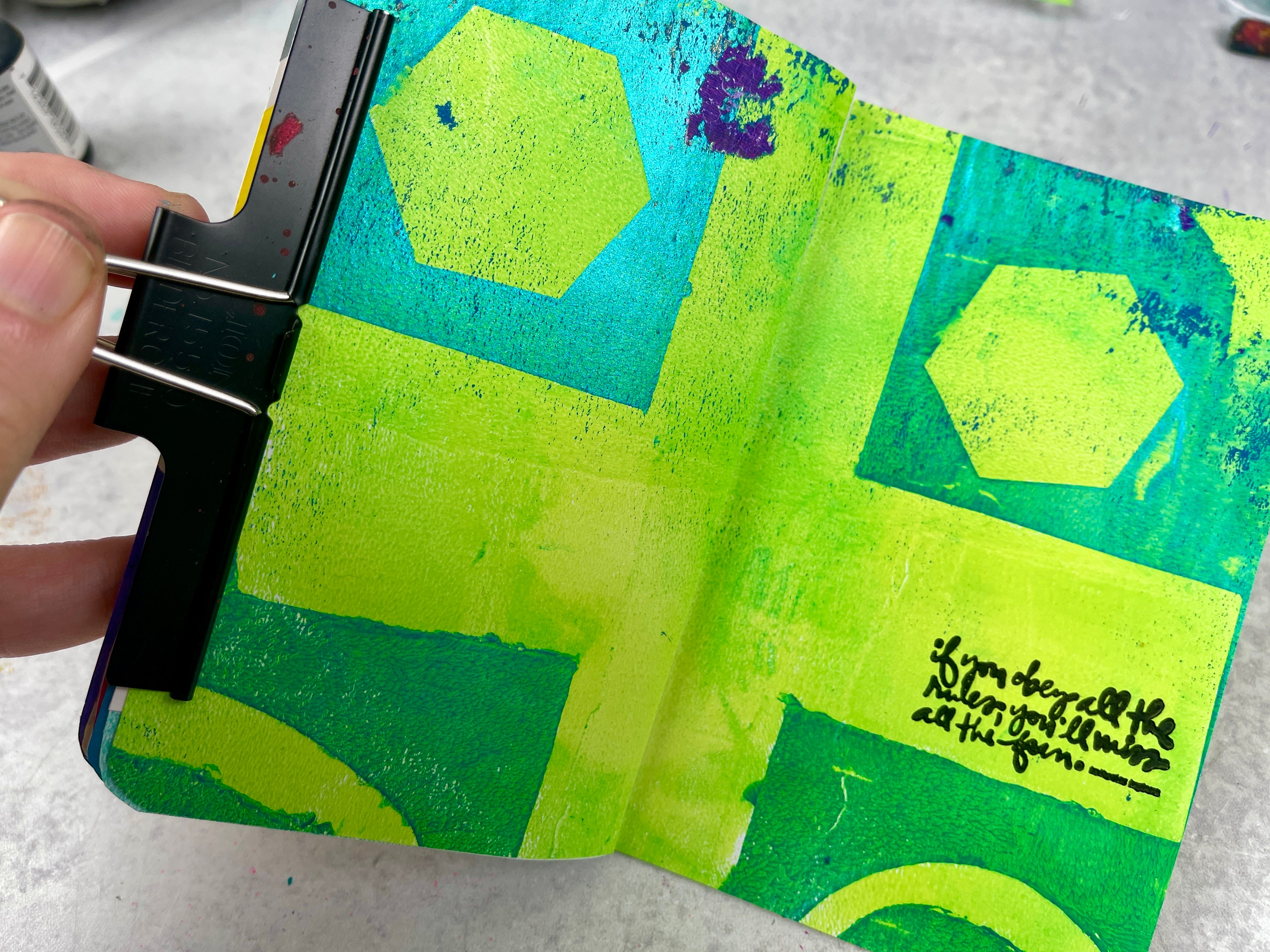
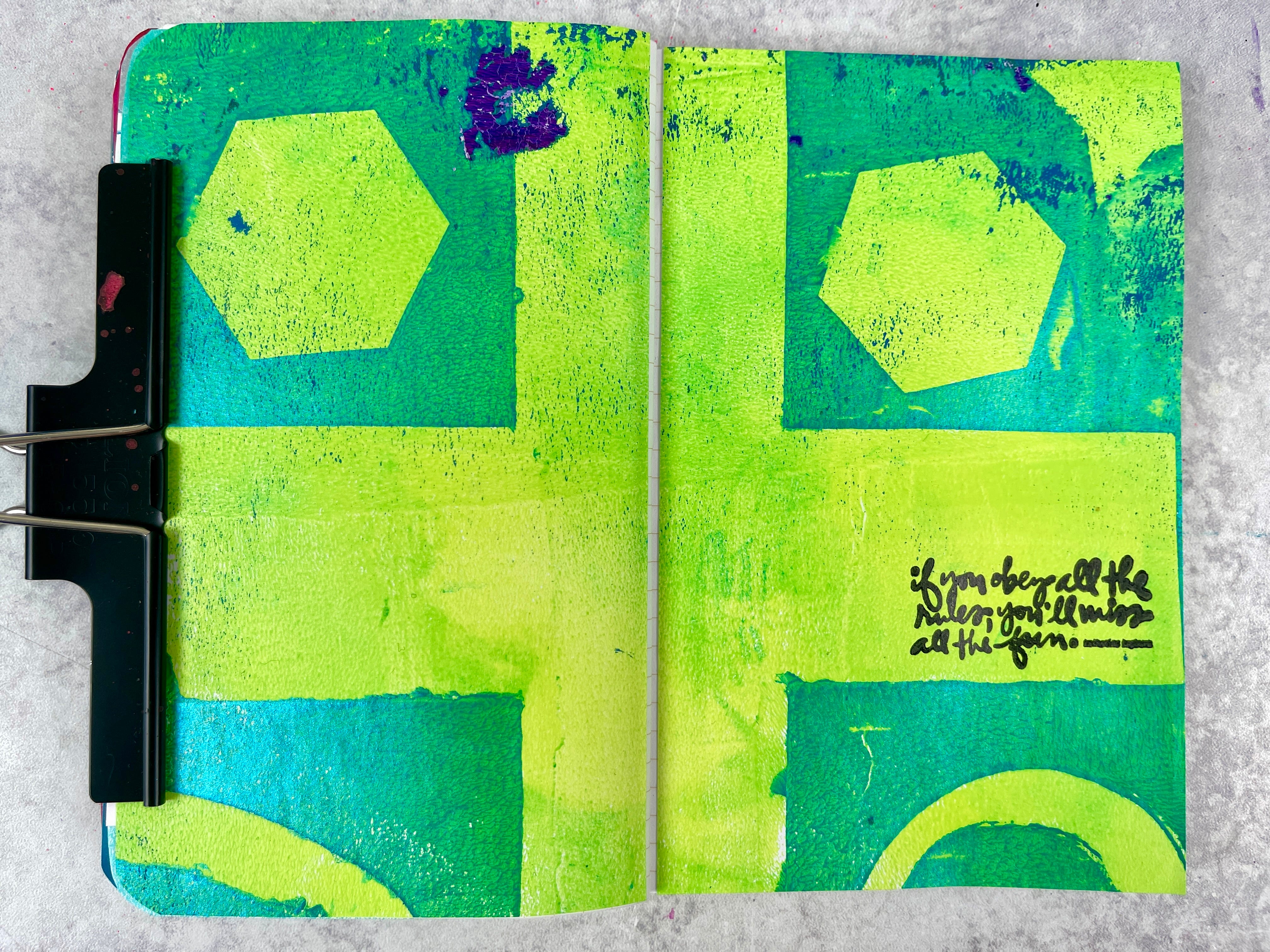
I had more fun with the new iridescent paints today. I wanted to mix them with a matte paint to see the contrast play out on the page and I’m thrilled with the result. Isn’t that shimmer so much fun?
For this two-tone look, I put down a bunch of different shaped masks that I created with some cardstock. After which, I put down a layer of the shimmery paint, pulled up the masks, and then went over the whole thing (after letting the first layer dry) with a layer of this fun yellow-green paint.
Reflections & Insights
I’m gonna be playing with these paints for a while. I just love the shimmer. And as seen today — it plays so well with the rest of my acrylic paints. I can’t wait to see what else I can create with them. I’ll keep you updated!
How It’s Made
Supply List
Paint — Artme Iridescent
Stash — DIY Cardstock masks
Stamp — Ali Edwards
Ink — StazOn
This post may have affiliate links.
Tips & Creative Wisdom
Hope you’re having a great weekend!
**If you’d like to unsubscribe from these Daily Pages emails, but continue to get other emails, click here and learn how to update your settings to best suit your needs.
